Monday, 13 January 2014

research into animation (animation project)

animation is a process where there are moving images or shapes, a continuous motion or illusion. of images which are all different to make whar this project will be about, which is animation. animations can be recorded on many different devices, even those which don't involve technology, these could be: a flip book,  motion picture film, or shown/ presented on digital media, such as: GIF, flash or video, to display ones such as this a computer, digital camera or projector can be used.

just like the GIF shown, animations are made of frames, depending on how many frames there are and how long each frame lasts for depends on the length of the animation and detail, such as this one is created of atleast 6-10 frames which play very fast to make the gif seem like a bouncing ball..

Animation creation methods include the traditional animation creation method and those involving stop motion animation of two and three-dimensional objects, such as paper cutouts, puppets and clay figures. Images are displayed in a rapid succession, usually 24, 25, or 30 frames per second..

Techniques 


Traditional 
traditional animation consists of photographs of hand drawn pictures, each pictures is used as one frame, and all the pictures are put together to make an animation., this can include as many pictures/ frames as desired but it will take a while to draw every little movement. depending on detail to create the illusion of movement
every picture is slightly different, so when put together it makes it seem the shape/ object is moving.
"drawings are traced or photocopied onto transparent acetate sheets called cels, which are filled in with paints in assigned colors or tones on the side opposite the line drawings. The completed character cels are photographed one-by-one against a painted background by a rostrum camera onto motion picture film ."

Stop motion animation
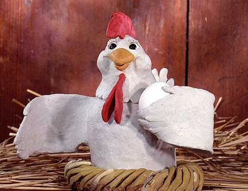
stop motion animation is basically manipulating real world objects, photographing them one frame at a time to create the illusion of movement. there are many different types of stop motion animation such as puppet:( obviously using stop motion puppet figures with an armature inside to keep them still and straight -- the pictures is showing an example of a puppet used in stop animation)
clay: ( uses figures made out of clay or any matierial like clay, some may contain a wire frame to keep them upstraight and still, for every frame the clay figures are modled in a way in which when playing all the frames back, it looks like a proper animation, using clay is probably really easy as it can be morphed into many different shapes -- this picture is showing a frame made completely out of clay)
cut out: (consists of cut out pieces of paper or material, cutting out many different shapes and forms, is apparently less time consuming than drawing everything.) these are just a few examples of stop motion animation.
 
Computer animation 
computer animation uses a variety of techniques of animation which are done digitally, some include, 2D, which mainly focuses on the image manipulation using basic 2D images, shapes and forms to create a simple or yet very complicated animation, kind of like cartoons you see some times, and then there is also 3D which is based around building a virtual world with objects and characters move and interact move them to your will, 3D can also make things look realistic to the viewer. (the picture is just showing an example of what 2D and 3D is)

there are many other types of animation such as mechanical  or sand animation or even pin screen, etc, but the ones i mentioned are probably the most well known or mostly used in the industries/ by people today and over the years.

Saturday, 4 January 2014

uses of media (sci fi project extended)

for my sci fi project i used 3 different medias: pencil/ traditional, water colour paints and digital / Photoshop, i had to use 3 different medias so i can see how i can work under 3 different types of medias and if i can understand how they are used and why they are used, and also why did i choose to use them, well the answer is quite simple.

pencil and pen: i used this for one of my concepts due to the fact it is easy and basic, i do try to use more challenging medias, but this is one of my favorite, i am able to sketch easily and create what i want easily without trouble due to the fact pencil is erasable. pencil is mainly used for sketching and drawing, it first outlines a basic image in your mind and if you wish to go into detail then pencil is good for shading and fine details, it gives a grate gradient effect and can be erased with ease. probably favored by many people. then there is pen which is mainly used for writing, but i use it for outlining, i believe it makes things look more bold and more clean, people do tend to draw with pen as it gives a more bold and straight image.

water colour: water colours are obviously used with ALOT of water, i used this as it is something new to me and i thought it would make a really good base, and also gradient effect with colours, and i was right, not only this but it can be used for detail too, due to the fact this was my first time PROPERLY using water colours, it only took a short while for me to first figure out how to use them correctly, then using them was quite easy and simple, its very fun to do, people would usually use water colours to create concept art or back grounds mainly, due to the fact it creates a nice gradient look on things, how to use them correctly would to start off with a very watered down colour and build up into much thicker and darker colours.

digital/ Photoshop: this was my first time using Photoshop, so obviously i has some hard times using it, however Photoshop is good for when you want to create a nice defined look on something, something bold with bright colours, something which you couldn't do with crayons, pencils etc. like pencil, you can erase and re do, but of course it's digitalised, it took some time getting used to but it is very easy to use now. people would usually use this for quick concept drawings or maybe certain art, this certain soft ware is also used for editing images, creating whole new images etc. very popular amongst many game industries

Tuesday, 17 December 2013

evaluation of project ( horror project)

what went well


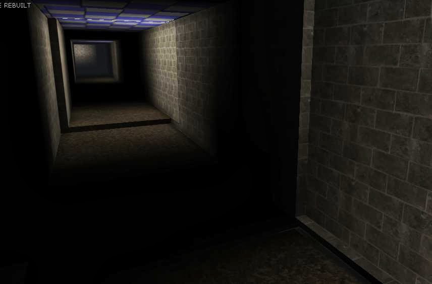
overall i think what went well in the entire project was mainly the designing and drawing part of the project and the creation of the level, first of all, i love drawing and so, the drawing, sketching and designing part was a breeze for me, it is hard to think of many different ideas, but after time went by as i was able to draw and sketch so many different things and come up with alot of ideas for my level, of course i decided on one, which brings me to how my level went well, it did take a very long time to create but over all i think my level was great, after everything had been created, i had a very easy time putting in textures and lighting to give it a more dramatic effect, also i knew alot of the detailed stuff, like creating animations for the doors, so this was a part that really went well ( the picture on the left is a birds eye view of the whole map of the level and on the right is just a screen shot of one of the main hallways in the level, basically showing you a glimpse of the lighting and texturing)

what was found difficult
what i found difficult was trying to do everything in such a small amount of time, i know we had 6 weeks to do the project but that is only 3 days a week, also trying to create a level which is finished and legit takes a very long time, as well so doing alot of design work takes a very long time, so these are the kind of things i found difficult, another difficult part was starting the level off and creating out the corridors, yes it was easy, but it took so damn long and kept messing up along the process.

encountering problems
the only problems i had encountered, was when i was creating my level, UDK decided to screw up alot so it took me a very long time to complete it, not only this but udk kept on not saving, it froze half way through the process, so again, it took me a while to finish, therefore because it took me a while, i didn't have enough time to texture the ceiling.


overcoming problems
i didn't really do anything special to overcome my problems, i just had to keep backing up my work, and working alot quicker due to the fact i had to work quicker, textures were unable to be put in places and also there where some parts of the level that where incomplete

what would i change if i did this project again
to be honest, i wouldn't really change anything from my project if i were to do it again, i really liked all the sketches and designs i could come up with, as well as the final concepts, i also really like how my level turned out, it came out just the way i wanted it and seeing as i have experience with the phobia i chose, it was easy to come up with something suitable, then again, i probably would change my time table so i am able to fit everything into the 6 week period equally and not have to rush at the end, that's all.

here are some more screen shots of my level, enjoy!
multiple path ways, this is located in the maze


kismet, you use this to create animations and such with matinee, for doors or figures etc
  second room- showing the dramatic lighting and door way


this is showing the beginning of the corridors and the open door.

feed back from level testing ( horror project)

after completing my gaming level on UDK, my level got tested by multiple people, however after they finished testing my level they had to answer some questions i had asked them, this is so i can get feedback on whether my level was good or not and what could be changed, also what i could improve on in the future, underneath i shall put down the questions with all the answers and then write on what i would improve on from my answers and also testing other game levels.

Q1: what key feature of the level was the best?
" The darkness in the corridors"
" the lighting, the player gets confused because they can't see etc"
" i liked that the level was in the form of a maze"
" the best part was simply how the level was not linear, and felt like a maze"
"the door opening  at the start"

Q2: what key feature of the level, was the worst?
"no textured ceiling panels"
"running into walls"
"could be a bit more tense"
"the areas where i had to do a slight jump to get through"
"i felt the textures were not seamless and didn't look realistic"

Q3: what would you change about the level?
"i would change the textures and the lighting as they are too repetitive"
"lighting"
"lighting, to make dark areas more visible"
"add materials to the ceiling"
"the doors on entry, trying to close when i stand on them"

Q4: does this level convey claustrophobia?
"yes, that was my initial thought, when i thought about the theme"
"in some ways yes, as the feeling of being trapped is present"
"yes, i think i went slightly mad when playing it"
"yes"
"yes"

Q5: did you like the idea of the level?
"yes"
"i thought it was really planned out"
"i like the claustrophobia maze idea of the level"
"yes"
"yes, although it can get frustrating"

Q6: if you were to create a level for claustrophobia, what would you do differently to what i did?
"tighter walls"
"i would make the narrowing of the corridors more obvious"
"would make the spaces narrower and taller"
"i would add spikes to the walls to make the player feel that they are going to be crushed"
"tighter corridors"

Q7 did you have fun?
"yes?"
"yes"
"yes"
"yes"
"yes ;D"


over all what people thought of my level was that it was a good level and it did convey the phobia of claustrophobia, which was my intention all along, i did get many comments from people saying that it was hard to find the way out, and they they kept giving up, which was a good sign, because claustrophobia is the fear of small spaces and the fact that you are unable to escape, of course some one as myself who has claustrophobia, would be very well known to this kind of stuff so i thought making a level i was quite knowledgeable on would be good.

the main things in which people said i needed to change or improve on my level was mainly the textures and the lighting, there were other things like doors and such, but the main one which came up alot was textures and lighting, because my level was really dark, however my level was SUPPOSE to be dark as it is a maze, you are not suppose to find your way out, as for texturing, i didn't manage to texture the ceiling so that is something i need to improve on, managing my time better so i can texture perfectly.

based off testing other levels which were created by other people, i think next time i shall improve on the texturing and the lighting to make things seem a bit more tense and eery, not only that but when playing the levels, people had cut scenes and elevators and all sorts of fancy things, so next time i should do some research on elevators, sounds, cut scenes etc to make my level better.

evaluation of the medias (horror project)

i had created a 6 panel drawing, using 6 different medias, alot of the medias i used where described on the last log book entry, with this 6 panel drawing i had created 6 images from my level, with the media and said how i found using them and if i liked them or not, or whether i'd use it again, in this log book i will simply say to go along with my drawing, "what didn't go well an why" and also "what will i use them for in the future"

what didn't go well and why

what didn't go well was the granite, the charcoal and the copic markers, first of all i have no idea how to use granite correctly as it was my first time using it, i merely used it like a thick pencil but didn't do well with using it, next was the charcoal, again, it was my first time using it, and so i had trouble trying to use it, charcoal is very messy and smudges easy, so therefore i found it hard to use, and it didn't go well, the last media was copic markers, i hate these things, yes they are good with creating a gradint-ish look on things, but when colouring in small areas, or anything in general, i find it hard to use, i do like the fact the marker has 2 different style tips but still, it is very hard to use in my opinion.

Uses in the future

pens and pencil : would definitely use this i the future, as i am used to pen and pencil i will mainly use this all the time for sketches and shadings, it's one of the easiest medias to use for me and so it will be most handy when sketching ideas and drafts

water colour: will probably be used always when having to research different medias, i love water colour and it i one of my favorite medias, i know i have to research OTHERS but  water colour will be one of the main ones i use for any paintings or further research in concepts and design.

Copic marker: i will use this rarely as i dislike this type of media, but i will use it mainly if i have to research about another media, or if i want to do a hard edge shading, that's what it is best for to me

digital: i will use this very often for designing and drawing, also for research into other medias, digital rt is very simple and easy to do for me and i do it on a daily basis, so like pencil and pen i will basically use it to sketch, design, and colour etc in the future.

charcoal: i will probably never use this again unless i wish to learn new techniques with shading and drawing, or if i need to research another media or use another media for my project.

granite: not much to say for this but i probably won't use this in he future, as i have no idea how to use it properly, some lengthy research would have to be done before i even consider using it.

different medias used in the project (horror project)

the different medias i'll be uing in this project is a big mix of things,  i will be using, of course traditional, which is pencil and pen, water colour paints, digital, charcoal, copic markers and  granite pencil ( only a bit)

Key attributes, what are they used for, How are they used.
the key attributes for any media is to help create something in which a person designs, they use this media DUE to its attributes, all medias have different uses and so they all help and do different things.

pencil/ pen: the main key attribute for a pencil is for sketching, seeing as pencils are so light (depending on how hard you press down) you can sketch anything, and also it can be easily erased if mistakes are made, pencils are also used for shading, pencils are very easy to shade with  as you can press down really hard, to letting it flow nicely across the paper to either create a hard shade, or a gradient shade.
for a pen, they are mainly used for writing, as using a pen to write is alot neater then anything else, also if you felt adventurous, a pen can be used to draw, if you are confident at making no mistakes then a pen is good for this.

water colour paints: the key attribute(s) for paints are basically... to paint, paints are well known to be good at mixing colours to get the correct shade you like and also blending and over doing, painting is a nice free form of media.  water colours is a type of paint you mix with ALOT of water, and with these yo can be as messy as  you like, especially when painting a certain image, you can start from a very light colour, going into the dark ones, being less messy as you go.

digital: very popular now, there are many different programmes which fit under the digital category, this media is of course, used for creating digital art, with digital art you can create a defined look on any art piece you probably couldn't do with other medias, digital art can be erased just like pencil, and you can sketch, colour messy and all sorts, just like the medias listed above, digital art is also known to be used in some game industries to create concept art in a very quick and neat way.

charcoal: charcoals key attributes are usually seen as charcoal being good for shading and creating tension in an image, due to it being easy to smudge and blend, it can create very good lighting techniques, and shading techniques, you can keep putting charcoal over charcoal until you reach the shade/ gradient/ lighting on an image you want. they can be used to create back grounds for concept art in game industries, with backgrounds, charcoal can create a specific kind of tension and wonder on the image to make it fit your desire.

copic markers: the key attributes for copic markers are they are basically for creating a certain type of gradient look in an image, starting with a very light shade you can build your way up to a darker shade. they are very useful for when building up an image from the lightest colour first to the darkest. like the other medias, they can be used for concept art,  lighting and shading effects

granite: like any normal pencil but can come in a much thicker size, especially like the one i used, it's attributes are for easy drawing and shading like the pencil, this can be used instead of pencil, but of course there are it's differences, such as if you use a much thicker pencil of granite it is alot harder to use.

Sunday, 8 December 2013

researching artists (EXPLORE project)(OPEN project)

over the next 9 weeks i will be researching and going into great detail into finding out about an artist of my choice, i will be learning many things about such an artist, their type of art style, the way in which they create their art, and also present a piece of work with their style of work.

after looking at some artists and their different styles of work, the one that catches my eye the most, and the one that interests me the most is the artist known as: georgia o'keeffe. for her types of art she would paint/ draw close up of blossoms, present them close up to make it seem as if they were being seen through a magnifying lens, i believe this is so such detail could be seen and the colours which hide which usually can't be seen when passing by, when when looking up close, the beauty of it is shown, and art is created.

born:  November 15th 1887
died: march 6th 1986
from: America

has a "feminine nature" to her paintings
"mother of American modernism"

her specific style/ field in the art industry is mainly paint/oil and charcoal
in 1915, she started her career with drawing charcoal drawings, of, of course, close up blossoms, this is something in which she enjoyed creating, especially when they got put onto show.
her work were given the words "pure" "fine" "sincere" etc.


not also did she do charcoal, but also normal canvas paintings which where also very popular, such as this painting for example, which is called "the white flower" it is a very beautiful flower with alot of detail, did you know that it is known that all her painting are created due to the things she would find lying around in her studio, this would include not only her famous blossoms but also, bones and also landscapes. with her art she would create a series of images which would probably create one image or a collection of one type of image, " Certain works of hers went on for decades, and produced 12 or more variations, of the same image she had created in earlier pieces of art." "she had created her work in a series, and with many of her pieces a series within a series,"

it is said that georgias work (the flower paintings) where "highly sexual" as the resembled the female form in a very erotic way, she claimed she was not afraid to try new forms, shapes, colours or anything as such, as long as her art has shown an image in which she wanted, she would be satisfied, whether the outcome is sexual and erotic, or not.
this piece of art is an example of one of her erotic female form flower paintings, just by looking at it you can see the resemblance of the female sex organ, this is what people meant when they labeled her art as erotic, she chooses to paint flowers in a way such as this to try and present the female form as maybe something beautiful and can be seen in many different shapes and forms.


another art form in which Georgia used was erotic photography, posing in such ways it would seem erotic, but I'm sure her intentions of such art where not to be seen in a pornographic way but it more of a female symbol art way, she shows and represents her female body as if to say that she is proud of being female and that her body is artistic and must be shown to the world, just like a males body, seeing as they come in different forms and shapes, they must be shown with pride, so that is probably what she was trying to do with this type of art style.